How I Made This Map
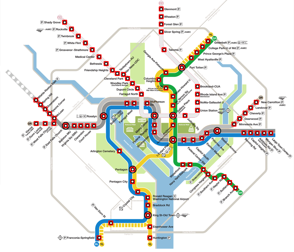
I was inspired by this map online to create a similar map of the Washington, D.C. metro system. The map of the subway system plots stations with uniform spacing, often placing them in a straight line, improving map readability but distorting the size of surrounding regions. I wanted to compare the positions of stations on the D.C. map with their geographic locations.
There were basically three steps to this process: obtain location and name data for each metro station, retrieve coordinate data from the metro-issued maps, and combine these data sets and illustrate the difference between the two.
Obtaining Metro Station Data from the Metro API
The D.C. transit system has a surprisingly useful interface for requesting information about metro stations, bus stops, and real-time information about the locations and times of the trains and shuttles. I wrote a script that gathered the name and geographic location of each station. Metro even provided standard geographic coordinates! I also downloaded the rail information for each line (basically the order of the stops). I exported both information sets to JSON objects which I could easily import for the model.
Retrieving Coordinates of Stations from the Metro Map
Once I had the geographic location of each metro station, I wanted to compare this to the station’s location within the map that Metro provides. This proved slightly more difficult than I had expected because Metro doesn’t export any version of the map other than the image - no image formats that I could decompose by layer or by shape to obtain relative coordinates for each station. This meant that I had to actually analyze the pixels of the image to find what looked like “stations”, find a name for each station, and output that list of station names and coordinates.
The easiest way I knew of to solve a problem like this was using an image analysis technique known as a template match. This is a way to look for similar occurences of one image within another. I accomplished this pretty simply using the Python library OpenCV.
Here are the basic steps I used to obtain the coordinates of each station icon within the metro map:
- Decide on a template image that matches the icon of each Metro station. Call its width \(w\) and its height \(h\).
- Decide on some match threshold \(T\). After a bit of guessing, I decided on \(T = 0.7\).
- Process the image using OpenCV to find the a score representing how well each \(w x h\) block of pixels matches the template. Choose each block that scores higher than the threshold.
- Filter this list of rectangles so that the distance between each rectangle is greater than or equal to \(\sqrt{(w/2)^2 + (h/2)^2}\). This removes the possibility of some stations matching the template multiple times.
- Enter each station name manually and export.
I had to tone down some of the brighter colors in the map so that the stations lying on those colors matched the template better. I also removed a couple icons that looked kind of like stations but weren’t, just to be sure. I could have made more use of OpenCV to detect station name labels within the image and map them to the closest station, but for the sake of time I just labeled each station manually. (There are 91 stations in the Metro system; this only took a couple of minutes.)

This technique worked pretty well. I then wrote some Javascript to combine these two arrays into objects for each station in the two states (map coordinates vs. actual geography) and create the animation between states. I also produced this GIF with stations labeled and this GIF without labels. Check out my code on Github for more detail on the actual implementation of these techniques.